Reiki + Tarot:
Brand Creation
Client
My Creativity
Year
Fall 2020
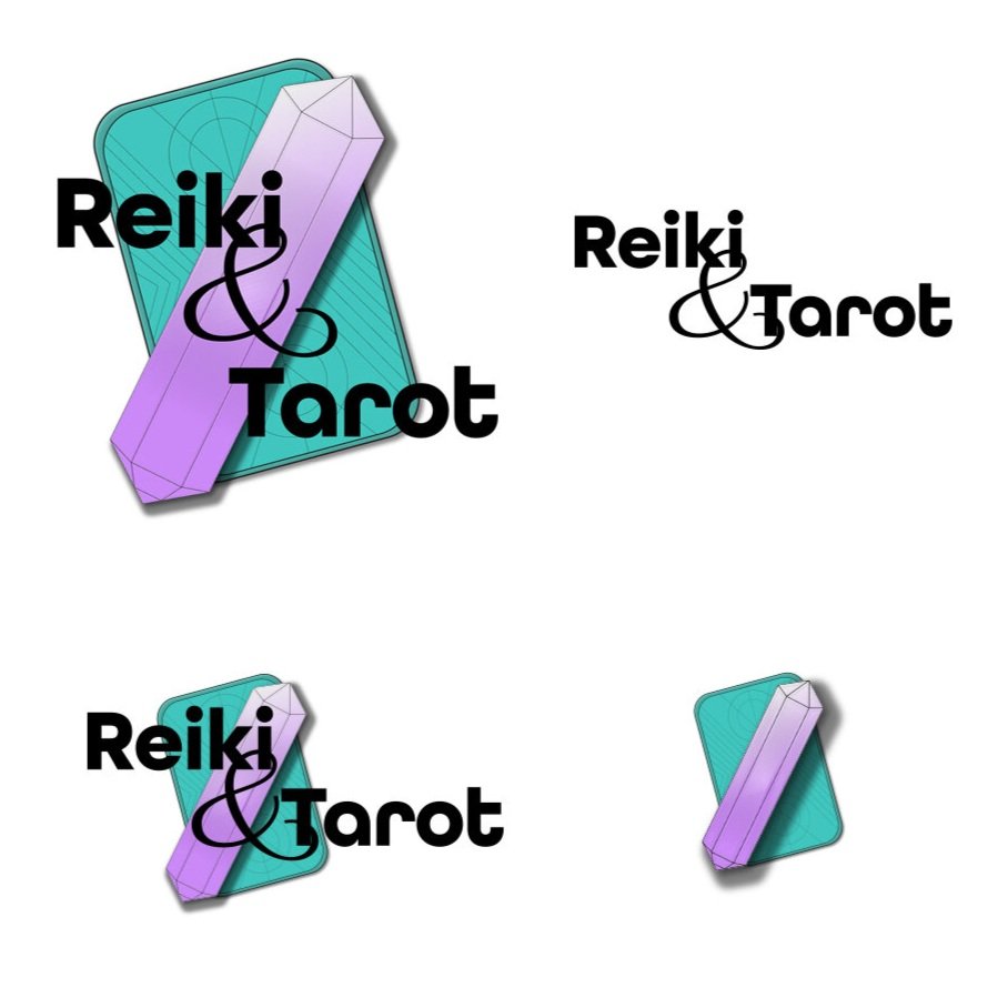
I developed this hypothetical Reiki and Tarot business to showcase my logo and brand design abilities through a personal project. First, determining the brand’s personality (approachable, calming, spiritual, supportive), and then using those details to create a visual brand that reflects the business.
I chose purple and teal based on colour psychology, as purple is seen as imaginative and spiritual, and blue represents stability while green evokes empathy and support. Choosing typeface, I also wanted to ensure that the brand was accessible and bold, but also to keep the overall feel light and flowy, so I landed on All Round Gothic for the logo and headers, and Questrial for body type.